Dark Mode Design: Why Your Users Love It (And How to Implement It)
Beyond just aesthetics, dark mode is a functional requirement in 2026. Explore the benefits of low-light design and the best practices for implementation.
Dark Mode Design: Why Your Users Love It
By 2026, Dark Mode is no longer a "feature"—it is an expectation. Nearly 80% of users prefer a dark interface when browsing in the evening or on mobile devices with OLED screens.
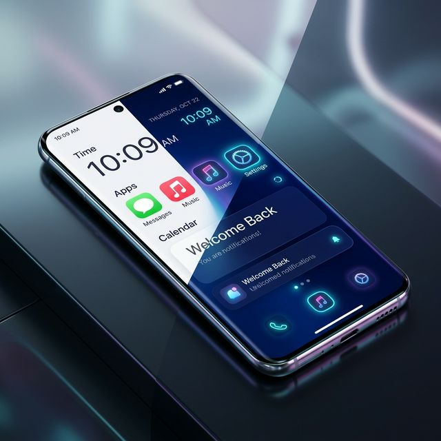
But true dark mode is more than just turning the background black. It’s a delicate balance of contrast, color hierarchy, and readability.
The Benefits of Dark Mode
- Reduced Eye Strain: In low-light environments, dark backgrounds reduce the "flare" of bright white screens, making long reading sessions more comfortable.
- Battery Longevity: On OLED and AMOLED screens (standard in 2026), black pixels are literally "off," saving significant battery life for mobile users.
- Improved Accessibility: For some users with visual impairments, dark mode provides better text-to-background contrast and reduces glare.
The 2026 Design Palette
We have moved beyond "Pure Black" (#000000). Modern dark mode uses Deep Onyx and Slate tones.
- Surface Tiers: Use lighter shades of gray to represent elevation. The "closer" an element is to the user, the lighter its color should be.
- Avoid Pure White Text: 100% white on 100% black causes a visual phenomenon called "halation" (where the text looks like it's glowing or vibrating). Use an off-white or light gray (
#E2E8F0) instead.
How to Implement it (Step-by-Step)
- CSS Variables: Define your tokens for both themes in
globals.css. - Toggle Logic: Use a library like
next-themesto handle thesystempreference and user overrides. - Media Queries: Use
@media (prefers-color-scheme: dark)to ensure a great first impression even before the user clicks a toggle.
Testing Your Design
Always test your dark mode in a brightly lit room. If you can't read the text easily, your contrast is too low. Conversely, test it in a pitch-black room; if it hurts your eyes, your accent colors are too bright.
Conclusion
Dark mode is a commitment to the user’s comfort and health. By implementing it thoughtfully in 2026, you ensure your platform is accessible and enjoyable at any hour of the day.